
Adult Family Home Website Design / Designed By Dane
Your home may be small. The decision families are making isn't.
Families are often researching the home before they ever contact you. A good Adult Family Home website should help them understand the care, the environment, the people behind it, and whether the home might be the right fit.
I design Adult Family Home websites that make that information easier to find, easier to understand, and easier to trust.
Here is the anatomy of a well-structured Adult Family Home website — a neutral schematic, not a real home. Each part exists to help a family answer one question they're carrying.
Your Home
Real photos of the property and rooms
Care & Services
Clearly, what support the individual home provides
Meet the Provider
Who operates the home and the people behind the care
Daily Life
Meals, routines, and the living environment where appropriate
Availability
Current vacancy or waitlist, if the provider shares it
Payment
The options this individual home actually accepts
Contact
One obvious next step for the family
A neutral schematic of what a well-structured Adult Family Home website helps families understand — not a real home.
Families want to understand the actual environment — not just read that it's "comfortable."
Clear, honest wording about the support provided helps families rule a home in — or out — without a guess.
A real person behind the home gives families important context about who they are contacting.
Meals, routines, and atmosphere turn a facility into a place a family can imagine.
When a home shares openings or a waitlist, families avoid reaching out about something that isn't there.
Knowing what a home accepts saves families time — and prevents an awkward conversation later.
When the next step is obvious, a family is far more likely to take it.
Facebook can be useful. Directories can be useful. Referrals and placement professionals matter.
But none of those channels give you complete control over how your home, care, provider story, photos, services, availability, and contact information are presented.
Your website is where they should be able to understand the home.
One of the things that makes an Adult Family Home different is the environment itself — smaller, more personal, and actually residential. The website should reflect that.
What a good AFH website leads with
What it should avoid
The goal is professional enough to inspire confidence, personal enough to still feel like a home.
A small residential care home that needed to feel as warm and trustworthy online as it does in person.
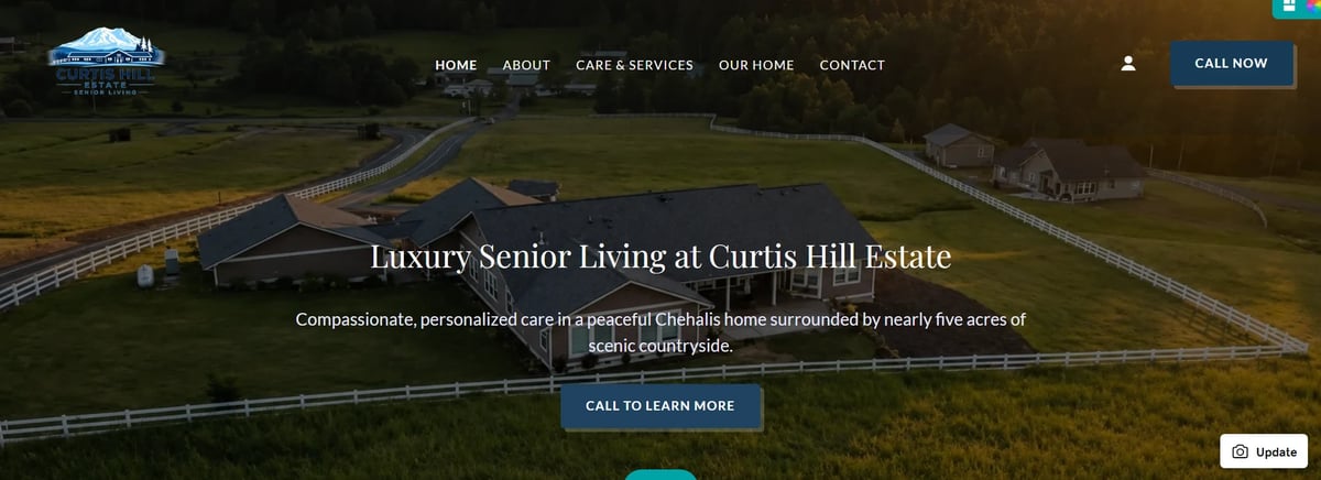
Curtis Hill Estate
Residential care / adult family home
Families researching care need to quickly understand whether a home is a good fit. The website had to communicate the setting, the care, and the day-to-day environment clearly — without feeling institutional or overwhelming.
A reassuring rather than clinical presentation. Clear, honest information about the home and its services. Simple navigation that puts the environment and photography first, and a mobile-first layout — because most families start this research on a phone.
A full website organized around what families need to see first: the home, the care and amenities, and a straightforward path to learn more or make contact. Quiet, unhurried pages that lead a visitor from first impression to next step.
A professional, approachable website that gives families a much clearer picture of the home before they ever make contact.
Rooms, shared spaces, accessibility, outdoor areas, gallery, and other appropriate physical details.
A clear explanation of what care and support the home actually provides — never implying every AFH offers the same thing.
A real person behind the business creates substantially more context than a generic company paragraph.
Where appropriate, explain meals, routines, activities, and what life in the home actually feels like.
Current vacancy, accepting inquiries, waitlist, or another appropriate status — if the provider wants it displayed.
Clearly communicate accepted payment methods where the home wants that information public. Never assume Medicaid, private-pay, or LTC acceptance.
Help families understand where the home is located and the surrounding service and community area.
One clear next step — a phone call, email, inquiry form, tour request, or another appropriate path depending on the individual home.
A website that quietly does its job online is built for people first — clear care information, clear location information, logical headings, and fast access to contact details. The search foundation is a byproduct of being genuinely useful.
The website is written for the family first. Search engines just need to understand it too.
Streamlined Website
Starting at $599
Best for a newer or straightforward Adult Family Home that needs a clean, professional, responsive online presence — typically around 1–3 pages.
Professional Business Website
Starting at $999
Many Adult Family Homes benefit from a more customized website with enough room to clearly present the home, provider, care, amenities, photos, FAQs, and contact information — with deeper content organization, SEO, and conversion structure.
I'll recommend the scope that gives families the information they actually need — not extra pages just to make the project larger.
No salesperson-to-project-manager handoff. You work with the person actually building the site.
The finished website remains your website — not a rented asset that disappears if you stop paying for it.
You may manage the site after launch, or keep Designed By Dane involved. Your call.
The site is built on the appropriate supported platform rather than forcing every home into one ecosystem.
The goal is not to sell the largest site possible. It's to build what the home actually needs.
Website builds through Designed By Dane start at $599 for a Streamlined Website, $999 for a Professional Business Website, and $1,799 for a fully custom Wix Studio Website. Larger or more complex projects are priced based on scope. You can see the full breakdown on the pricing page.
It depends on the home. A useful structure often includes Home, About, Care / Services, Amenities / Daily Life, a Gallery, Availability, FAQ, and Contact — but none of these are mandatory. I build around what your specific home actually needs to communicate.
That depends on the platform and how the site is built, but a good build is structured so appropriate content — like availability or contact details — is reasonably manageable after launch without needing a developer for every change.
Yes — when you supply appropriate photography. Real images of your actual home build far more trust than generic stock imagery, so that's what I encourage wherever possible.
Yes. I can evaluate redesigns, new pages, mobile problems, content structure, and visual improvements. Not every existing site needs to be replaced — sometimes the right move is targeted improvement.
No. Your website doesn't become a subscription because I built it. Website Management is available as an optional service if you want ongoing help, and normal third-party platform or domain expenses are handled separately.
Designed By Dane is based in Washington and can work remotely with businesses elsewhere. For care-home work, I'd want to understand any state-specific regulatory context before making content recommendations — I don't assume one state's requirements apply to another.
I can't guarantee any specific ranking. What I can do is build a strong foundational search structure — clear content, logical headings, descriptive titles, and a clean local-search foundation. Whether and where you rank depends on many factors, and ongoing local/SEO work may be separate.
Whether you're preparing to open, already operating, rebuilding an older website, or simply need something more professional than what you have now, tell me what's going on.
I'll take a look and tell you what I think makes sense.